Destination Chat | Byron Bay
In the first Destination Shot Chat, we turn our attention to Byron Bay, Australia, where Simone Caprodossi, award-winning photographer and dive centre co-owner at Sundive Byron Bay, offers up a selection of images showcasing the local marine life highlights at the simply epic dive site: Julian Rocks.
Guest Star | Simone Caprodossi
A highly capable underwater photographer, Simone’s impressive imagery has been regularly recognised in contests such as the Underwater Photographer of the Year, Ocean Geographic Pictures of the Year, and the Siena International Photo Awards.
During a dive career spanning over 20 years, he has been privileged to witness many of the world’s greatest underwater sights and places. Yet, when the moment finally came to leave behind a successful corporate career, Simone chose Byron Bay as the right place to pursue a full-time dive life. Today, Simone is the affable co-owner of Sundive, along with marine biologist and shark researcher Dr. David Robinson, eager to share his photographic expertise, and always on the look-out for an opportunity to join the dive boat, camera in hand.
You can see more of Simone’s images on Instagram.
To find out more about diving at Julian Rocks head over to Sundive Byron Bay.
Introduction
Simone Caprodossi: So, a little about Julian Rocks, if you guys have never had the chance to visit. It is a really incredible dive site with an abundance of large marine life, comparable to what you might find in very remote islands, but just a 5 minutes ride by boat from very touristy Byron Bay beach.
“In summer, with warm water, we get arguably the largest aggregation of leopard sharks (aka zebra sharks) in the world”
The diving is very different in winter vs. summer as water temperatures go from 18-19°C to over 26°C. So, in summer, with warm water, we get arguably the largest aggregation of leopard sharks (aka zebra sharks) in the world, with tens of them taking full residence. In summer, manta rays also come down from the great barrier reef, though they are a more occasional sighting.
“We also have a huge number of wobbegongs - 3 different species - that make it a guaranteed shark dive.”
In winter, the leopard sharks are replaced by grey nurse sharks that also stay for months in very large numbers. Then, year round, we have the fixed residents: a few massive loggerhead turtles, lots of small green turtles in the shallows, and few hawksbill turtles that are very unafraid of people. We also have a huge number of wobbegongs - 3 different species - that make it a guaranteed shark dive ... to this mix you can add great diversity of fish, massive groupers, eagle rays and very rich macro life that no one has had enough time to explore (I intend to in the coming months, so the next Shot Chat we can do macro at Julian's) - so my selection reflects the key marine life we have.
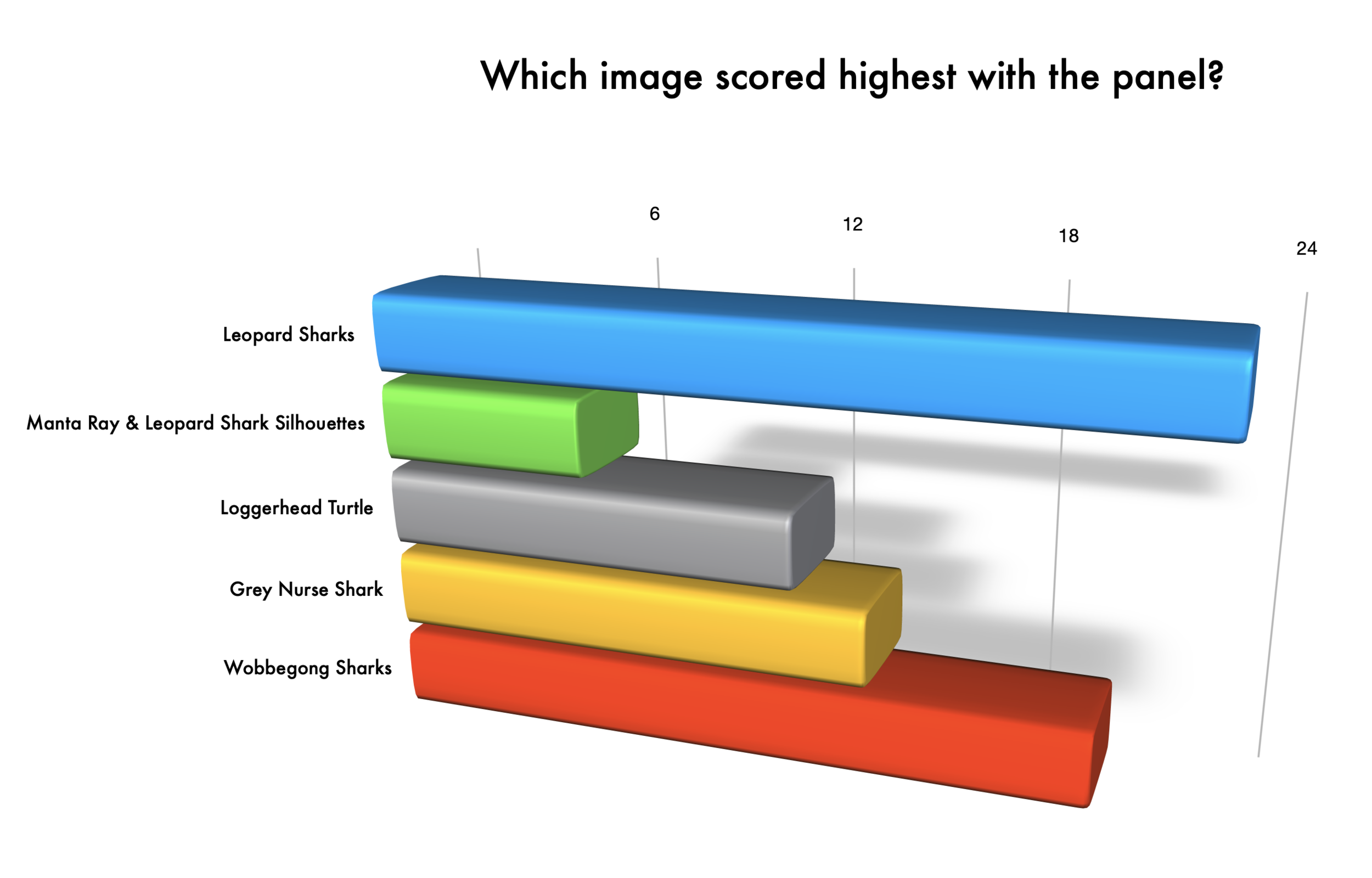
Jade Hoksbergen: Hi Simone! What a great selection of images. I have personally never dived Julian Rocks, but Henley has, I was busy babysitting our little Apolline during our short stay Byron Bay, building sand castles and soaking up some sun. Your selection of images certainly does give a good sense of what it has to offer... which is a lot! My personal preference for is: 1. Leopard Sharks , 5. Wobbegong Sharks, 4. Grey Nurse Shark, 2. Manta Ray & Leopard Shark Silhouette, and 3. Loggerhead Turtle.
Henley Spiers: My first impression goes something like this: you lucky (insert expletive of choice)! Julian Rocks is such a great site, surely one of the best in the world, and to have that as your 'house reef' well, good choice! I was lucky enough to dive it a few times with Simone and was blown away by the richness of Julian Rocks - so much iconic marine life, and the fact that you haven't even had the opportunity to explore a whole aspect of it (the smaller stuff), speaks volumes in terms of how much incredible life there is to witness.
The images are strong and very enticing, but naturally it's the Shot Chat so I'll spend more time discussing the possible areas for improvement. First impressions here are that the wobbegongs (5) is my favourite, it's then tight between the turtle (3), leopard sharks (1) and grey nurse (4), with the silhouetted scenic (2) being my least favourite. Looking at the set, in each I see things which could have been tweaked either during shooting, or in post-processing, which would have yielded an even stronger final image. There is little doubt that I probably take underwater photography a bit too seriously, and it hurts me when a shot hasn't reached its full potential, whether it be mine or someone else's.
Grant Thomas: I’ll start of by saying I have dived at Julian rocks but unfortunately had far from ideal conditions at the time, due to big swells and wind, which produced visibility of less than a couple of metres. I was actually diving with Sundive but it was back in 2014, so before Simone took over operations. This is is a world class dive site though and I would love to go back! My first impressions of your images, Simone, are that you’ve beautifully captured the true essence of Julian rocks with all of the animals that are synonymous to this famous dive site.
Shane Gross: It's a commendable goal to choose 5 images that show off a single location. Rather than 5 single images, we now have a story where, ideally, each image works to elevate the other. In this case, we want visual variety, while still maintaining a certain style. To have the 5 images work together, if that's the goal, I would either go all black and white or all color. So, I think this collection would be stronger without the black and white image.
Leopard Sharks
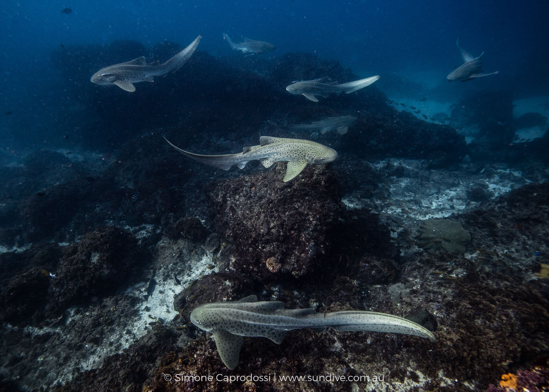
1/200, f/14, 1/200, ISO 640. Canon 5DSR, Canon 16-35mm @ 16mm, Subal Housing, Inon Z240 strobes. Author: Simone Caprodossi
Simone Caprodossi: This one is about the leopard sharks... I have many pretty leopard shark close-ups but I have been trying to get a sense of the aggregation and I personally like this one, though it is a bit dark and without a close subject...
Jade Hoksbergen: My favourite out of the selection. What makes a leopard distinctive? Well, certainly their spots as their name suggests, but also their swirling tails. When I look at this still image, it doesn't stay still... it comes to life. The composition of the shark pack is beautiful. We see several in the background, and are finally presented with a single one in the plane closest to our eye. My attention is first given to the leopard shark at the centre, but then moves to the background, appraising every single one, until I am looking at the final one in the foreground. The different directions in which they swim and their tails twirling left and right creates additional dynamism, and I can see the image move. There is a great sense of harmony created by the placement of each individual shark and overall composition... it's not always easy illustrating a "pack" of animals in such a visually effective way. So, well done, Simone. Love this one.
“The different directions in which they swim and their tails twirling left and right creates additional dynamism, and I can see the image move. There is a great sense of harmony created by the placement of each individual shark and overall composition.”
Henley Spiers: Holy moly, what a stunning animal and to have successfully captured 7 of them in a harmonious position is a serious achievement - well played. As Jade said, you feel their slinking movement through the frame...it's a gorgeous composition from the main subject here. The thing with Julian Rocks is there are, well, a lot of rocks...so it's tricky to get a really clean background for the sharks. Over on the other coast of Australia, I find the shots of leopard sharks in Ningaloo to be stunning (even if they are actually simpler to achieve than this one).
The patterns on the sharks are just wow...But then maybe I'm approaching this too much from a fine art perspective, whereas your image is a much more compelling natural history shot. There isn't much I would change about the shot...but I find the corners too soft, is that due to aperture? Or dome port/extension? In post-processing, I'd have tried to run lens correction to lessen the slight vignette, for me it's nice to open up the shot more, allow the scale of the scene to breathe to a greater extent. And although I know that even on a clear day the water there is rarely crystal, I would have cleaned up a a bit more of the backscatter, especially in the upper left hand quarter of the shot.
Anita Kainrath: My absolute favorite is this first one with the leopard sharks. I love the dark, moody colors and the whole scene is mesmerizing. I've never seen leopard sharks and it makes me want to be there right away. You've captured it perfectly - the light is stunning and you can just feel their movement. I don't think I would change anything there. Totally photo competition material here!
Grant Thomas: My favourite of the lot and not only because I love arguing with Americans about whether they are called leopard sharks or zebra sharks… yes they start off looking like zebras but they spend most of their lives looking like leopards so…. Anyway, back to the point - for me the defining feature of this image is that you have skilfully managed to capture 7 sharks in one frame and all at pleasing angles, not partially hidden behind any rocks or obstructions. I also really like the way the ambient light has spotlit the shark in the middle, drawing my eye into the centre of the frame. There are a couple of points that let the image down - like you’ve already said, it would have been nice to have a close-up of one of the sharks in order to give more depth to the image and add greater wow factor. The fact the sharks are almost all swimming parallel across the image, again makes it look a bit flat - factors that of course are out with our control when shooting wild animals. My last niggle with this image is the backscatter - it looks as though it has been created with strobe light and I wonder how useful the strobes were at lighting such a large scene? Maybe it would have been more effective to shoot only ambient light. Overall, a great image and a hard one to capture!
Shane Gross: I like the dark and moody feel. I like the position of each shark. As Jade mentioned, it really makes your eyes wander through the whole frame, holding my attention. The middle shark in a spotlight is such a gift. Could you imagine this scene behind a close-up of a mighty leopard shark tail in the foreground? Go bring that shot back for me!
Simone Caprodossi: For the leopards, I agree it would be nice if the bottom had more interest especially in that center part ... but I don’t find the Ningaloo shots as inspiring ....perfectly clean shots but lacking as much wow factor for me (although I do love Alex Kydd’s imagery in general, especially his cownose ray shots)...Many people have shots like that at Julian’s, over the sandy trenches on a clear day, but I like a bit more uniqueness or behavioural interest in the shot ... less than 3 leopards in a frame lets Julian Rocks down.
I actually like the flat plane of view but agree I should have switched off the strobes. I was actually shooting a closer shark swimming shallower and then as it passed I saw a good number of them below me and moved up a bit to shoot down onto the scene. I eventually switched the strobes off, but the sharks never came together again so nicely…
2. Manta Ray & Leopard Shark Silhouettes
f/18, 1/200, ISO 800. Canon 5DSR, Canon 16-35mm @16mm, Subal Housing, Inon Z240 strobes. Author: Simone Caprodossi
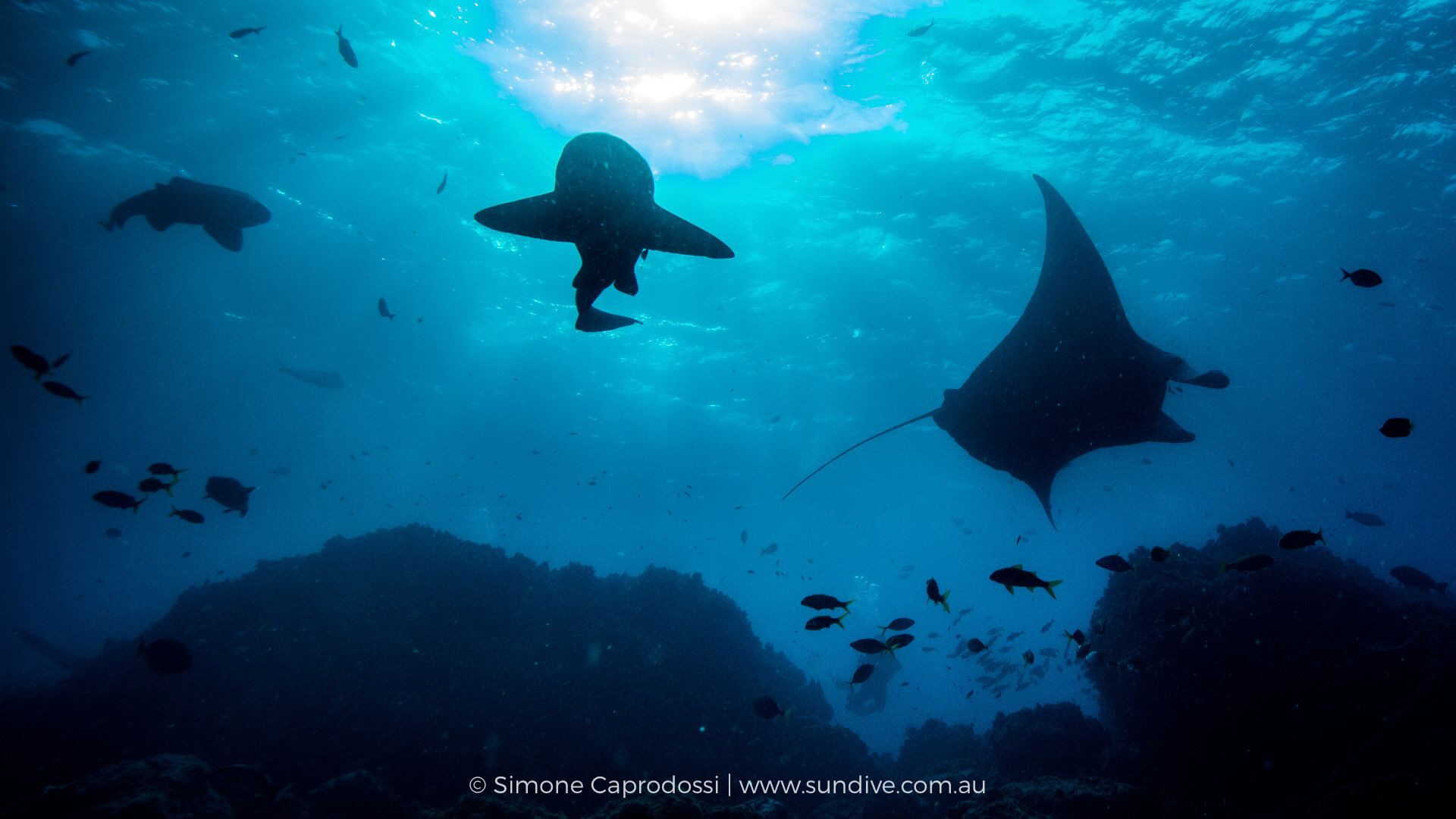
Simone Caprodossi: I’ve been trying to get a good shot of a manta ray and leopard shark together to give a sense of summer diving...that's as close as i got ..(by the way, in that moment you could also see, out of frame, a turtle and a guitar shark - one day I'll get them all!)
Jade Hoksbergen: If I'm appraising these images through a 'fine art' lens and being hyper-critical, then this is one of the weakest out of the selection. Don't get me wrong, that is not to say that the image isn't any good... far from it. It all depends on what the purpose and audience is. For instance, I think that for a scuba diver wondering if Julian Rocks is worth the visit, this shot sits up there, and is one of the best for reeling you in... It shows not just the numbers but the variety of life present at Julian Rocks, and really does make you want to plunge into its waters. With a tilted angle shooting upwards and shot in relatively shallow waters, we can also see the surface and sunlight, making it all the more alluring. TAKE ME THERE NOW!!! But if I was looking to buy an art print for my living room, this wouldn't be the one I would choose out of the selection.
Henley Spiers: At first glance I was impressed by this one, with its peaceful suggestion of a site bursting with life. When I looked closer, I saw things which bugged me...I think in the case of silhouetted images, it is really important to have clean lines, and these shots in their highest form nail every small detail. It looks simple and easy, but it's not. The two leopard sharks and the manta ray across the top, with the dark, rocky mounds below, work very well here...You had the main elements nailed. I also thing this more panoramic crop works well. Two things frustrate me...Firstly, the sunburst is ugly, with a desaturated centre, then a jarring transition from magenta to blue. This type of sunburst is a common issue when you are at medium kind of depths, and with movement on the surface. What I tend to do with these, to try to make the transition feel better, is work with the HSL sliders. I'll move the aqua hue to the right (about +50), blue slider (about +5). Then rather then desaturate the aqua, I'll boost it a bit, and maybe a touch on the blue too. It's something I picked up from Gaby Barathieu, and he has written an excellent blog about it.
Secondly, the diver behind the small fish in the canyon...his silhouette is broken up by the fish, and he isn't in a pleasing pose...just, not ideal...you could probably cut him out quite simply, lose some fish in the process but it may be worth it. So, I'd really like to see this shot again but with a couple of post-processing tweaks.
“I think in the case of silhouetted images, it is really important to have clean lines, and these shots in their highest form nail every small detail. It looks simple and easy, but it’s not.”
Anita Kainrath: This picture is okay. Don't get me wrong - it's beautiful but I feel like I've seen this kind of photo composition / subject many times and it's a bit overexposed on top. Maybe a nice memory but I wouldn't know where to use this image. But I'm no good in taking silhouette shots, so I don't feel like I have the right to judge this one.
Grant Thomas: I love the idea of capturing two different animals together, as it always makes for a unique and interesting shot. What I like most about this image are the silhouettes, which you’ve captured well as I know immediately what animals i’m looking at. The leopard shark in the background on the left is not so obvious, due to its defining features merging into its own shadow, but I think this could be cropped out entirely in my opinion.
The element which I feel lets this image down most is the sunburst - as Henley said it’s quite jarring. It looks as though you were possibly too deep to get nice sun beams or that the surface of the water was just a bit rough. possibly under exposing more could have saved some of it or having a slightly more downward composition so that we don’t see so much of the sun, but of course that compromises the rest of the image.
Shane Gross: This is an almost image. It feels messy to me. The sunburst is a problem, the shark on the left is a problem. Maybe taking down the exposure will help. It's an amazing moment that doesn't happen every day, but I think you're just going to have to wait for the right moment. This isn't it.
Simone Caprodossi: Completely agree this image is the weakest because of the ‘ugly sunburst’ as someone pointed out. I still love it as a promotional image for the action it displays, but it is an example of a potentially great but seriously faulted photo ... I had to give out one photo to concentrate the shame on ...I loved Gaby Barathieu’s tutorials, and will try it on this shot, but this was an improvised sunburst with just the wrong settings and honestly too strong a sun... I would have needed one subject to cover more of it ... stupid leopard swimming in the wrong place ... so I am not sure how salvageable it will be ... but some great post processing advise for many other images closer to be good enough
I don t think it could have been really salvaged, as changing angles would have lost the manta silhouette that is the only strong point, and I tried underexposing more but then it becomes really too dark, as the water was already pretty sombre. As Shane said, it just was not the moment. For me it just has a place in the midst of more images on our website to illustrate what you can see at Julian Rocks ... and it was intended to offer space for a lot of critical comments and really succeeded at that!
3. Loggerhead Turtle
f/18, 1/160, ISO 640. Canon 5DSR, Canon 14mm, Subal Housing, Inon Z240 strobes. Author: Simone Caprodossi
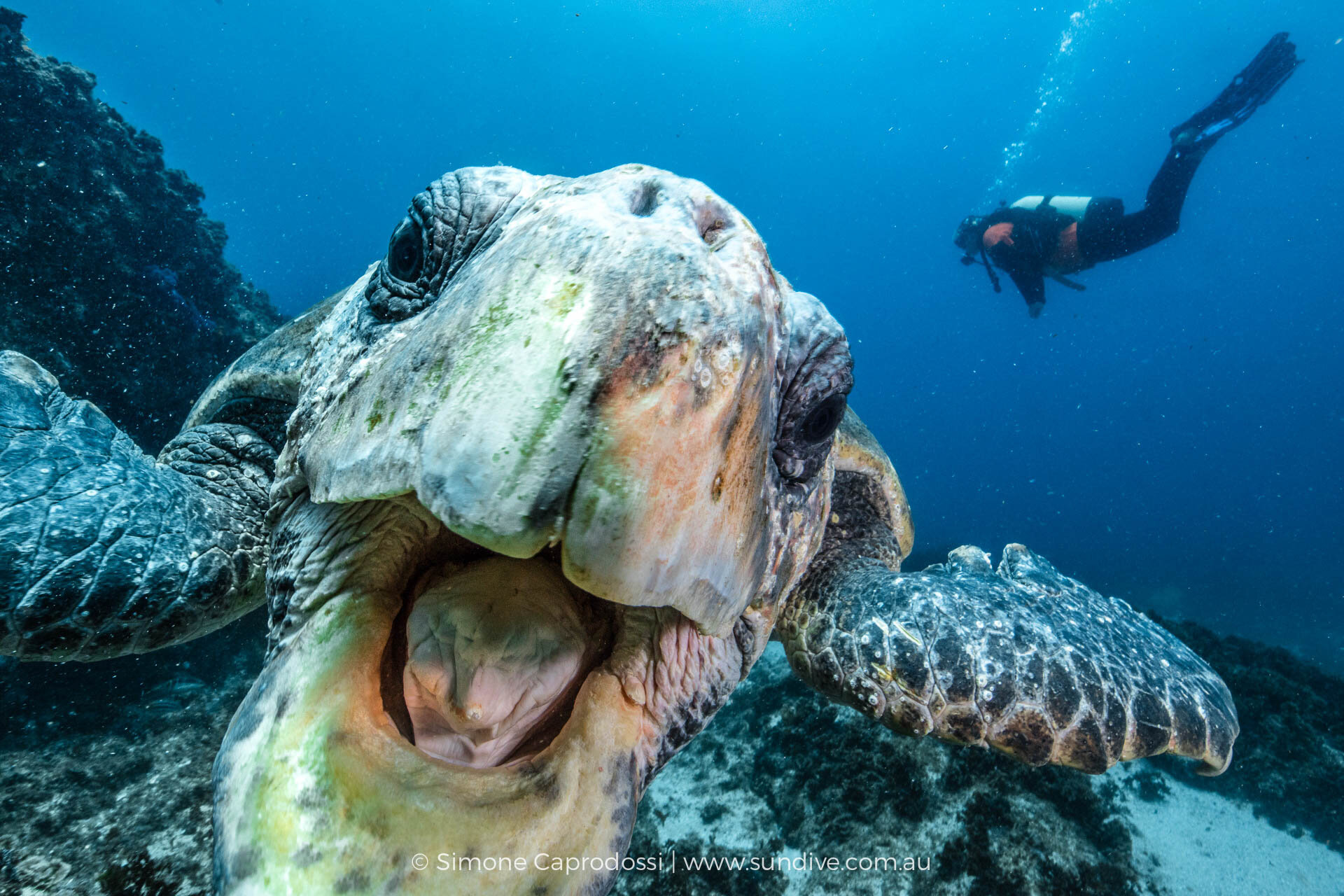
Simone Caprodossi: Ok after a few gloomy shots here is a fun one. This is ‘Terrible Ted’, the loggerhead who wants to eat your dome port and likes to also chew your BCD ... not photo comp material but lots of fun ..
Jade Hoksbergen: Weakest of the selection for me, and even so, looking at it makes me happy and brings a huge smile across my face. We mentioned our human tendency of attributing human traits or emotions to animals (i.e. anthropomorphism) in our last chat. I mention it again now because well, that turtle looks like one fun, laid-back, happy dude. Remember the turtle in Finding Nemo? Crush? The 150 year old turtle?
In short, I find this image to be packed with humour because (1) first thing I did when I saw the image is smile in response to the turtle "smiling" at me, and (2) I find it satirical. Maybe it's because we live amongst a generation where the average person's camera roll is filled with selfies, but this picture looks to me as if it's the turtle that has just taken a selfie with a human being in the background. The turtle looks all amused and bemused that a human being has come to explore his grounds!
Henley Spiers: Unlike Jade, I think this is a cracker...wish I'd taken it! I mean BAM! It hits you hard...you feel the intensity of the moment, and yet it's also harmonious, your eyes going from the turtle's mouth, to its eyes, and then the well-posed diver on the right (even if they are likely oblivious, this is proof of why it is good to buddy up with trim divers!). And then my eyes wander back to the turtle, taking in its very weird looking tongue...You've lit it really nicely, with illumination across the turtle, even though it is right on the dome. It's super...really like it...high impact shot, can see it doing well in articles, advertising...eye-grabbing. Now, as we have seen, I'm a stickler for details...so I would have cleaned up the backscatter, and tried playing with the white balance or HSL to make the colour pop even more. I'd like it to be a touch less green, more blue and orange...
Anita Kainrath: My second favorite shot is this hungry loggerhead. Love it. You didn't overexpose her even though she obviously came very close. I like the diver in the background, good thing he isn't cut off as then he wouldn’t have been helpful to the composition. I just love the turtle. She was so curious. How come it is so used to divers? Do people feed her and that's why she/he comes so close? I agree, definitely not photo competition ready but a great memory and I think a wonderful portrait of this individual.
Grant Thomas: I always enjoy photographing these guys, so cheeky! I’m in two minds as to whether having the diver in the background adds to the image or not. If I had the option to shoot straight on, having the mouth and face more central, then I would probably have done so and waited until the diver was out of the frame. However, I understand that this not always possible and it may have been a spontaneous opportunity. I like that the eyes and majority of the face are all in focus but the upper part is slightly over-exposed and therefore has lost a bit of detail. I find the white balance slightly off (too much green) and would have preferred a richer blue water column, which I think could have been achieved in the HSL Panel. My last niggle is the backscatter. Hope that didn’t sound too harsh Simone because i actually really like the image!
Shane Gross: It's a fun moment, but I've seen this shot many times and done better. The diver in the background takes away because they are not interested in the turtle. Had they been facing the turtle a little bit it would be much stronger. In this case, including the lower jaw would have helped. It looks like your left strobe didn't fire, which may be a blessing as we might be really over-exposed if it had. Taking down the exposure might help add some mood to it and help it flow better with the mood of the first two images.
Simone Caprodossi: Totally agree that the turtle is no competition or art shot but it’s definitely a crowd-pleaser and I just love it for the humour and the connection. It’s unforgettable moment underwater that I relive every time I look at that chunky tongue.
The loggerhead is just a very long term resident and seems to enjoy the odd cheeky bite of the divers ... no feeding would ever be allowed at Julian Rocks. You may just be taking a picture and feel yourself being pulled at the back and it's Ted biting your BCD .. he's just a friendly bugger!
I like the diver in the turtle shot because the orange vest is what our dive guides wear, so for the purpose of marketing/ website it makes it very Sundive, but I fully agree with Shane it would be more meaningful if he was swimming towards the turtle.
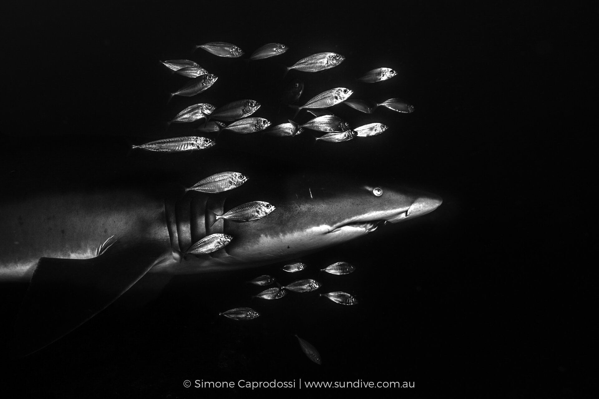
4. Grey Nurse Shark
f/5, 1/160, ISO 320. Canon 5DSR, Canon 14mm, Subal Housing, Inon Z240 strobes. Author: Simone Caprodossi
Simone Caprodossi: Coming to the winter season and here is a grey nurse shark ...I am not big on B&W but i thought this converts quite well...
Jade Hoksbergen: A very effective black-and-white, and certainly a punchy image. I'm not an expert in black-and-white imagery, so I'm not sure I'm the best to judge this image.. I do like my colours as you may know... Interested to know what Henley thinks... similarly to him, I am a fan of minimalistic black-and-white imagery. If this image was to be a fine-art print (as it would certainly suit that category), I would clean up some of the backscatter at the lower portion of the image, and possibly even the little fish that is swimming away from the school.
Henley Spiers: This is beautiful and well captured in-camera, but it's not living up to its full potential in my eyes. I would definitely go for a portrait crop here...I think it would reinforce the character of the shark, and the story of these accompanying fish...seeing more of the shark's body, and negative space in front, doesn't help the image in this case. There is a subtle yet annoying halo around the snout of the shark...this sometimes occurs when high contrast post-processing is applied...I think by pushing and pulling the contrast tools in lightroom a bit more, you could eliminate that and just have a pure black finish around the shark and fish.
Anita Kainrath: I really do like it and I think it's a great portrait, but I think I would lighten it up a bit. It's a bit too dark for my taste? And I like Henley's idea for a portrait crop.
Grant Thomas: I actually think I like this image as much as the leopard sharks. Strong, bold and simple. You get what you see. I do think the overall composition could be improved slightly by cropping in from the left and allowing more space on the right for your subjects to move into. I would also like to use the adjustment brush to take down the highlights of 3 of those fish as i find them slightly overexposed, taking attention away from your main subject, which looks perfectly exposed.
Shane Gross: When you compare this to Tanya Houppermans’ sand tiger, aka grey nurse, aka ragged-tooth, it's just not in the same league and, although it's from another part of the world, it just will be compared, no way around it. The side angle feels a little flat to me, I'd much rather see a more head-on view...possibly a portrait orientation with the fish surrounding the toothy face. I also see the weird halo around the shark, as mentioned before, which makes it hard to look at.
Simone Caprodossi: Confession: this is a total postproduction afterthought that did better than I imagined with you guys. I went out on a day of very crap light in winter, and the coolest thing was this grey nurse with a crown of fish. We don’t get them with lots of fish around usually here. I never got close enough for a really good shot but managed this one, sharp from a distance ...this is a massive crop but with the DSLR I have plenty of megapixels for printing quality ... I like the very sharp blacks and whites and simple composition in B&W. So with the very bright fish and dark greenish background I thought it would convert well. I had to brighten the shark a bit as it got too dark when i darkened the reflective fish and the job is a little sloppy, hence the halo. Since you guys did not mind it, I cleaned it up a bit to remove the halo and cut it vertical as suggested .... and it starts to be a potentially nice image.
Simone’s revised edit and crop of the grey nurse shark.
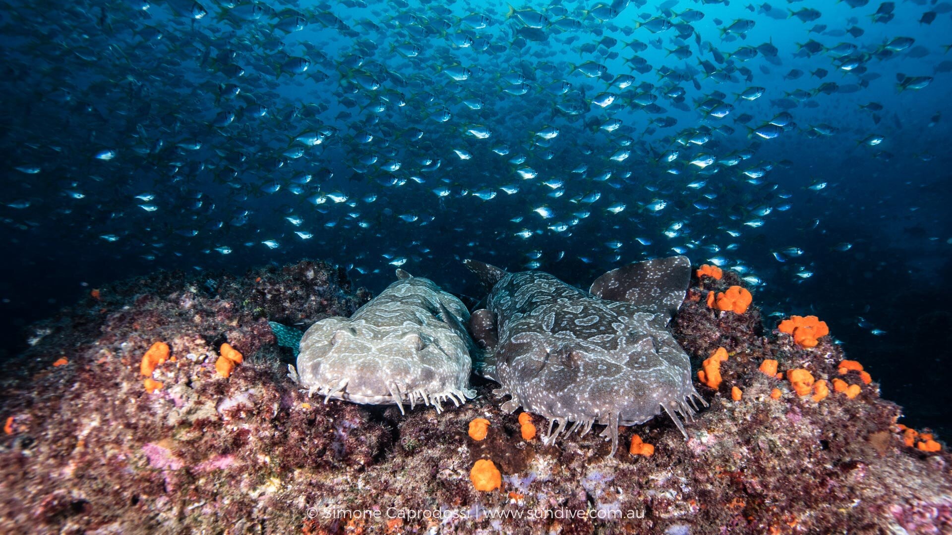
5. Wobbegong Sharks
f/11,1/160, ISO 800. Canon 5DSR, Canon 16-35mm @18mm, Subal Housing, Inon Z240 strobes. Author: Simone Caprodossi
Simone Caprodossi: And finally, wobbys, despite being here 2 years I still can’t resist stopping to photograph wobbegongs .. I think there is a seriously amazing wobby shot still waiting to be taken ... this is not it but one of my favourites so far.
“ I still can’t resist stopping to photograph wobbegongs .. I think there is a seriously amazing wobby shot still waiting to be taken ...”
Jade Hoksbergen: LOVE THIS IMAGE! From the glittering sparkles in the background, to the spots of luminous orange on the seafloor, to the irresistible pair of sleepy wobbys... what's not to like?
Henley Spiers: You know, I went to Raja Ampat in the hopes of seeing wobbegongs, and struggled big time...and then I came to Julian Rocks and they were flipping everywhere. I was losing my mind but all your regular divers were just so used to it that they didn't even stop to have a look. It's a great place to try and shoot them, but they are challenging subjects, blending in so well and with those flattened bodies. This is a cracker, love the feel with these two sharks side-by-side, a burst of orange beneath them, and a sea filled with fish above...gorgeous, well done!
But...yeah...there had to be a but right...those corners are super soft, a shame in such an attractive big scene, where you want to soak up every detail...as mentioned before, is this aperture or equipment related? That's my main issue...although if I'm being very picky, I'd suggest dimming down the highlights a bit on the lighter-shaded, left side shark too...
Anita Kainrath: I like the composition very much. The two right next to each other, surrounded by bright orange coral, beautiful clear blue water and a school of fish in the background. Perfect setting. I just feel like the foreground (left corner especially) is a tiny bit too bright compared with the rest? And I think I would try to lighten up the water a tiny bit more so that you can soak up more of the surroundings.
Grant Thomas: A great image which shows off perfectly the nature of the bottom-dwelling wobbegong. My favourite aspect of this picture is that you have managed to capture the sheer quantity of life on the dive site, which fills the image from corner to corner. The schools of fish and encompassing reef act as a frame for the wobbegongs, which sit completely still amongst all the action. I actually get that strong contrasting feeling just from looking at the picture, which is great!!
The areas I feel that let the image down are firstly the soft corners, which could be due to a wide aperture or just dome port optics? And secondly, I find the lower part of the image a touch too bright, which I think could be fixed slightly with some adjustment brush, but I would also have liked more strobe light cast across the top of the sharks and deeper into the background. To achieve this, I like to have my strobes up high and pulled back, around the 2 and 10 position or ‘Rabbit ears’ as the grandmaster Mustard has termed it.
Shane Gross: This image is so suited to a double page spread in a magazine. Especially if we crop a bit from the lower left (or better yet, get closer). Have one shark per page with a killer background of fish. Great scene and I'd probably move it to be shown first among this selection. Again, could be the opener double truck for a story on Julian rocks...just use a gradient filter to even out the strobe light and crop it tighter. Nice shot.
Simone Caprodossi: I do agree that there is some lighting unbalance as most of you pointed out. I had entered this in a couple of comps so I edited for comp rules and did not use any localised adjustments in postproduction. I am not sure if rabbit ears would have worked when shooting here as i was shooting on a pretty upward angle from close below the wobbies and i am not sure i would have had the right lighting on the lower foreground?
On the soft corners, I usually use the fix 14 that is a lot sharper on the edges, I just had some issues with it for a few months. The 16-35mm has always been soft on the edges though, even if I have always used the recommended extensions ... it would probably be better with the glass superdome, but not very convenient.
To Shane’s point, the brief for my selection was not for the images to go together - I agree they would be a terrible mismatch then - but rather to give an idea of the different marine life you can see at Julian Rocks, while offering quite different kinds of images that would make for interesting criticism. I would definitely not send images 2 or 4 to anyone.
Wrapping It Up…
Simone Caprodossi: Thank you so much for the detailed feedback, I expected no less than one or two areas for improvement per image and you delivered. I feel one common criticism is Simone is a lazy backscatter remover...guilty as charged... I like to say I keep them to Natgeo standard as Thomas Peshack once told me he never removes any for his National Geographic shoots ... but truthfully, I definitely should spend a bit more time in Lightroom...
Shane Gross: I just want to stick up for backscatter! I leave the backscatter in my images unless it's being used for a very specific purpose. The ocean and other underwater realms have particles floating! That's the environment! To remove it is to take something away! You mention Nat Geo doesn't remove backscatter and neither does Wildlife Photographer of the Year. I think they are correct. Okay, that particular rant is over for this chat.
“ I just want to stick up for backscatter! I leave the backscatter in my images unless it’s being used for a very specific purpose. The ocean and other underwater realms have particles floating! That’s the environment! To remove it is to take something away!”
Simone Caprodossi: Thank you for the candid feedback and for defending a touch for real backscatter from these artsy, perfect background snobs!
Shane Gross: Thanks for being a good sport, Simone, and for not giving us only perfect images (which I know you have). Makes this Shot Chat a lot more fun!
Henley Spiers: I feel like invoking the Nat Geo/Peschak clause will now be everyone's go to strategy in such cases, and it is a compelling argument! I do think you should always be very conscious of what you are shooting for, and something like the WPY does have very strict criteria on backscatter removal (a lesson i learnt the hard way, but that's a story for another time). In the moment, I think it's important to always push ourselves to try and capture a clean, full frame, as we envision...but of course that's easier said than done. If an image is destined for a publication or competition where backscatter removal is acceptable, I will always try to do so if I feel the specks have a negative impact on the shot. In some cases, a bunch of backscatter can actually look great - Shane's seahorses spring to mind.
Thank you for this set Simone, as mentioned, this is not a portfolio review, we are not looking at your very best images, and it takes courage to put forward work which has both beauty, but also potentially, some flaws.
Whilst I still love the wobbegong shot (5), the 7 leopard sharks (1) is the one which lingers with me, and has grown in my estimation. Shane's point about the diver not engaging with the turtle is a good one, I still like it but now that my eyes have been opened to that aspect, it has slipped slightly. Reminders of Tanya Houpperman's sand tiger shots, combined with your revelations of serious cropping, have also brought shot 4, of the grey nurse shark, down a notch for me. Image 2, of the many and shark silhouettes remains the weakest, and we all seem to agree on that.
Grant Thomas: I applaud you Simone for putting forward a collection of images that were not all polished shots, as most photographers including myself would usually shy away from doing so in fear of the critiquing wrath of a judging panel. It's funny how so many UW photography discussions come back to backscatter and I apologise if i made it sound like a big gripe for me, i didn't intend that as I do agree with you all that backscatter is just part of our uw environment and is natural. I don't always think it should be "cleaned" in post, but I do think that it can always be reduced with careful strobe positioning and power selection.
Jade Hoksbergen: My rankings of the images as stand alone images is still pretty much the same, but it was great reading everyone's comments. I realised my comments were mostly about my first impression and how the images made me feel, and why I liked them. I don't like being bad cop, you see! Okay, back on point... The shot of the leopard sharks and that of the wobbegong shark couple really stays with me. I agree with Shane that the spotlight that falls on the middle leopard shark is really a gift. I just love this image! With the wobbegong sharks, unlike Grant, I don't mind so much that the bottom half of the image is overexposed a touch. I worry that if we darkened it, the sharks would blend in too much and there wouldn't be enough separation for our eyes to really see and appreciate the wobbys. Perhaps worth a play with the graduated filter on lightroom just to compare... I may be wrong. But like Grant, the soft corners are a little annoying. BUT I still love it! The three other images are cool images, but those two really stand out for me!
Shane Gross: The order hasn't changed for me 1) wobbies 2) leopard/zebras 3) turtle 4) b&w and 5) silhouette... thanks again, Simone, you chose meaty images for debate! Very appreciated!
Anita Kainrath: For me it's: 1) leopard/zebras, 2) turtle, 3) wobbies, 4) b&w & 5) silhouette very interesting choice of images- all so different from one another. Thank you, Simone!
Grant Thomas: My order of preference has not changed and i would still rate the images in the order of: leopard sharks, wobbegongs, B/W grey nurse, turtle, silhouettes.
Simone Caprodossi: I just want to really thank you all I loved reading the Shot Chat from the beginning but being the ‘victim’ of it has been real fun and really interesting, and helpful to get such candid and rich feedback. Thank you again and I look forward to taking you out to see the real Julian Rocks!
